
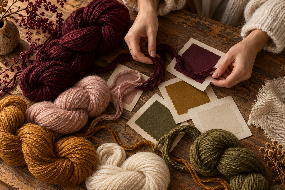
A palette is the beginning of a conversation
A colour card can change the direction of a project in a moment. A muted green suggests a quieter collection; a warm neutral gives a brighter shade something to sit beside. Looking at yarn colours together allows an idea to become visible before a fabric has been made.
That creative response is useful. So is the next, more practical step: recording exactly what you are looking at. An attractive image becomes a much better sourcing reference when it travels with the yarn code, the colour identifier and a clear statement of what you need to confirm.
Keep the yarn reference and the colour together
When a shade catches your eye, save the product reference as well as the image. In our current catalogue, a code such as Y100-000001 identifies the yarn record you are discussing. A colour name by itself may be too broad to identify the same item later.
If the card includes a colour code, copy it exactly. Keep any leading numbers or letters, and note which card the code came from. When you send several choices, label them in order of preference. This makes it easier to distinguish a first choice from an alternative.
Treat the screen as a starting reference
A screen image is convenient for sharing an idea across a team. It is still an image viewed through a particular display, under particular lighting. The colour you see on a phone may look different on a colleague’s monitor or beside the physical materials in your studio.
For a colour-critical project, ask how the shade will be confirmed for the actual order. Discuss whether a physical reference or sample is appropriate and what options are available for that yarn. Avoid making the image do the work of a confirmation process that has not yet been agreed.

Look at the palette in the context of your fabric
The colour is only one part of the choice. Ask what construction you intend to use and which other materials will appear beside it. A colour that works well as a small accent may feel very different across the surface of a complete garment.
Collect your references in a simple board: the yarn card, the intended fabric direction and the neighbouring colours. This does not replace technical evaluation, but it helps explain your intent. It is often easier to discuss a deliberate combination than an isolated screenshot with no context.
Make the enquiry easy to answer
A useful message includes the yarn code, your selected colour identifier, the quantity you are considering and the delivery destination. Add the intended use and any target date. If you are still choosing between two shades, say so rather than presenting both as a confirmed requirement.
You can also ask what information is needed to move from a provisional selection to an order. Keep the questions specific to the reference. A clear exchange gives you a better basis for comparing options and deciding what to do next.
Keep a record of the final choice
Once a colour has been discussed, save the final agreed reference with the product specification and quotation. If your project has several contributors, make sure they are looking at the same version of the brief. An earlier mood board can remain part of the creative record without becoming the ordering instruction.
The pleasure of colour comes from possibility. The confidence to order comes from knowing which possibility you have chosen. Give both parts of the process the attention they deserve.
Compare actual yarn references
Use the photographs below to connect this guide with a specific product code and card. Each page records the available specification and any details that need confirmation.


Contact us to confirm the exact yarn, complete shade code and availability before checkout. One confirmed, individually packed 1kg sample is US$19.90, with shipping additional. Evaluate the physical yarn before discussing a quantity-based bulk quotation.
Confirm a yarn for your sample trial.
Browse yarn references or tell us about your next project.
Explore the collection ↗Ask about a yarn